INTRODUCTION
Candlestick and OHLC (open-high-low-close) charts are bread and butter for the finance industry. Plotly lets you create interactive, D3.js candlestick and OHLC charts without writing code. You can import stock data for any ticker for free via simple Quandl URLs. This tutorial shows you how.
1. IMPORT THE DATA
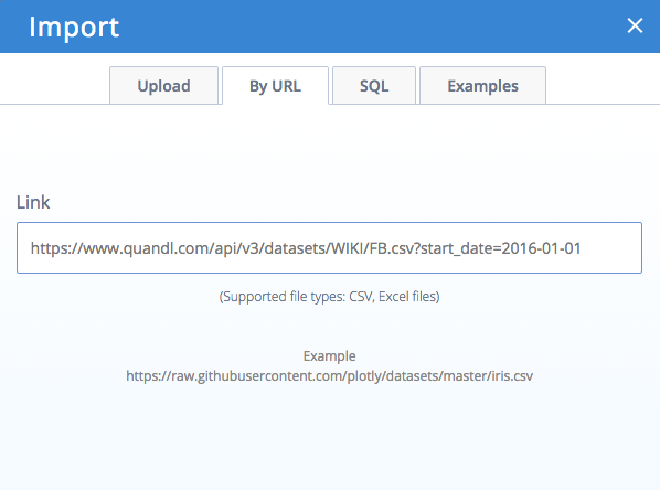
- Go to:
plot.ly/create?upload=url&url=https://www.quandl.com/api/v3/datasets/WIKI/FB.csv?start_date=2016-01-01 - You should see this:

- Hit Enter to import the data.
2. GRAPH THE DATA
- Select “Candlestick” as the chart type
- Select “Date”, “Open”, “High”, “Low”, and “Close” as the columns to graph.
Steps 1 & 2 only take a few seconds and look like this:

3. STYLE THE DATA
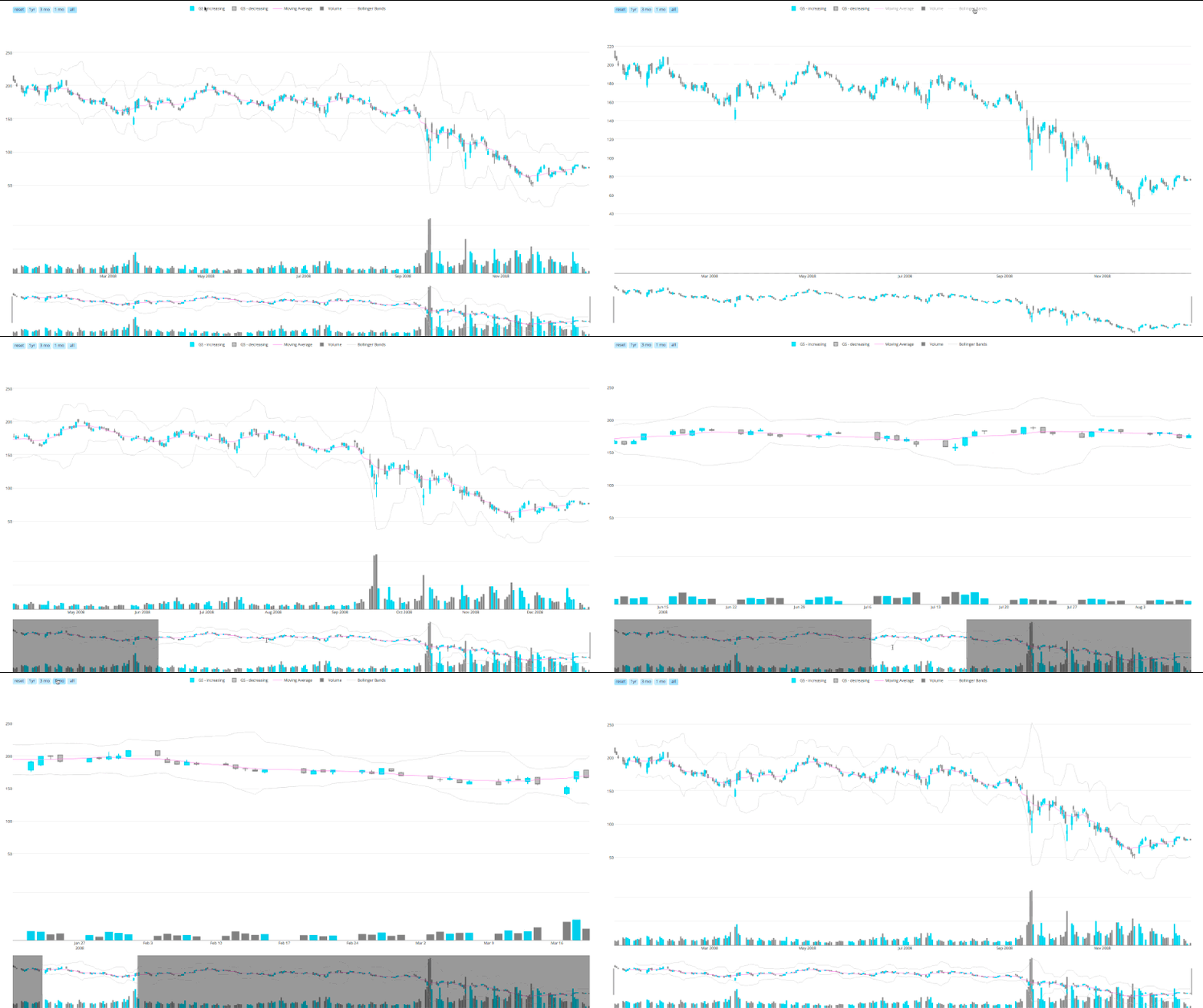
There are practically infinite options for styling under the “Style” pane. After a few minutes of clicking around, you can get a candlestick chart that looks like this:

The above chart was made in Python with this script, but could be made just as easily in the code-free, online editor.
4. PLOT MORE DATA
The above example used Facebook stock data from 2016 – try with other stock data from Quandl too:
APPLE
NASDAQ
PRICE OF CRUDE
BITCOIN PRICE VS USD
https://plot.ly/create/?upload=url&url=http://www.quandl.com/api/v1/datasets/BAVERAGE/USD.csv
Avoid plotting more than a few years of data in candlestick or OHLC plots – the chart interactivity will slow down.
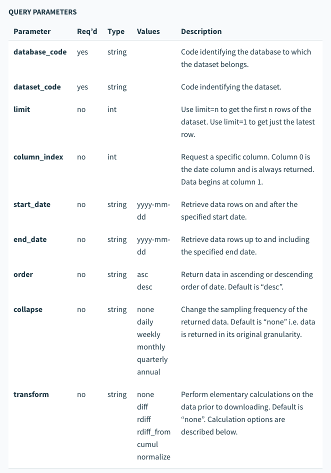
The Quandl URL API is flexible and feature-packed. You can choose your stock ticker, set the date range, and even aggregate the data. Read about it here or browse their impressive collection of datasets to get your own financial data.
URL options for Quandl CSV fetching:
