Plotly dashboards are interactive and highly customizable. They can be made through a data science language like R or Python, or entirely in Plotly’s online GUI.
Dashboards for drug discovery have been traditionally made with desktop progams likes Spotfire and JMP. Most engineering and scientific software, however, is transitioning to the web for improved graphics and collaboration. Software in the pharma industry is also making the switch.
We’re sharing 3 dashboard of charts made by Plotly users who work in drug discovery: A 3d small molecule finder, a Structure Activity Relationship (SAR) table, and an interactive Kaplan-Meire survival plot.
1. 3D SMALL MOLECULE FINDER
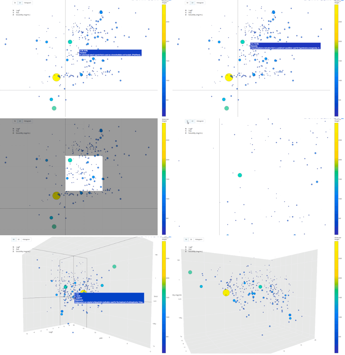
Search a database of therapeutic small molecules in 2d or 3d:
2. STRUCTURE ACTIVITY RELATIONSHIP (SAR) TABLE
Compare how the molecular weight (MW) of a drug compares to the MW of other drugs:
3. INTERACTIVE KAPLAN-MEIRE SURVIVAL PLOT
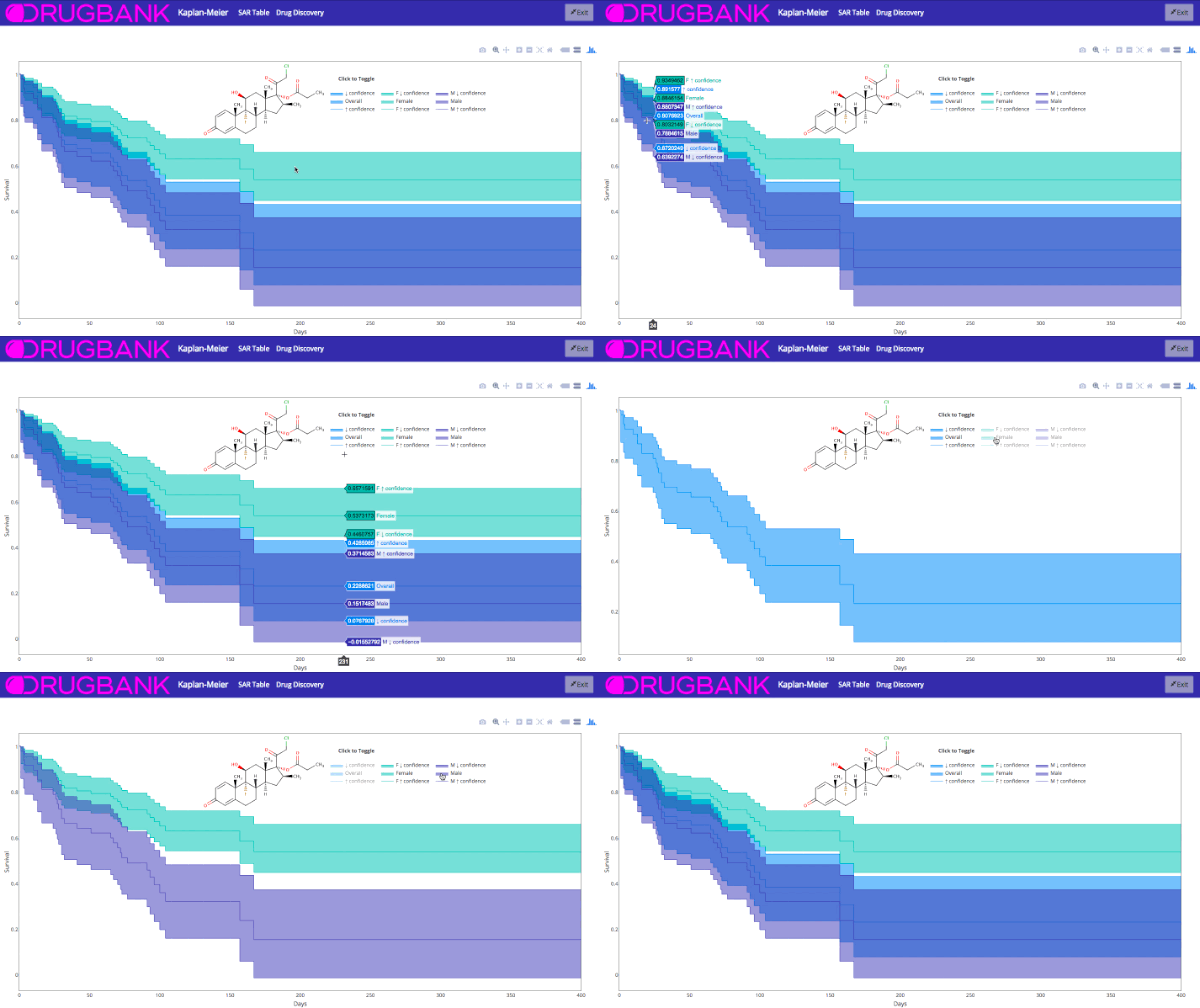
Kaplan Meire curves are frequently made with Plotly’s R and Python libraries. When you use Plotly with R and Python, you get interactive (D3.js) graphics with no extra time spent.
View the survival plot dashboard
4. BIOTECH/PHARMA DAY AT PLOTCON OAKLAND
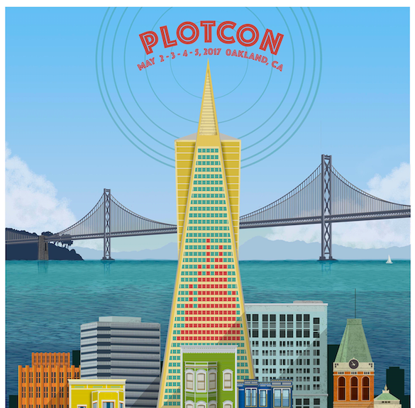
If you like this post, consider attending PLOTCON OAKLAND, May 2-5. There will be a full day dedicated to the intersection of biotech/pharma, open-source software, and data visualization.
Data visualization pioneers from Genetech, the Chan Zuckerberg Initiative, UC Riverside, and the Pathogen and Microbiome Institute will be sharing their experiences and perspective on open-source visualization software. Get tickets now while prices are still low:
GET PLOTCON EARLY-BIRD TICKETS
7 INTERACTIVE BIOINFORMATICS PLOTS MADE IN PYTHON AND R
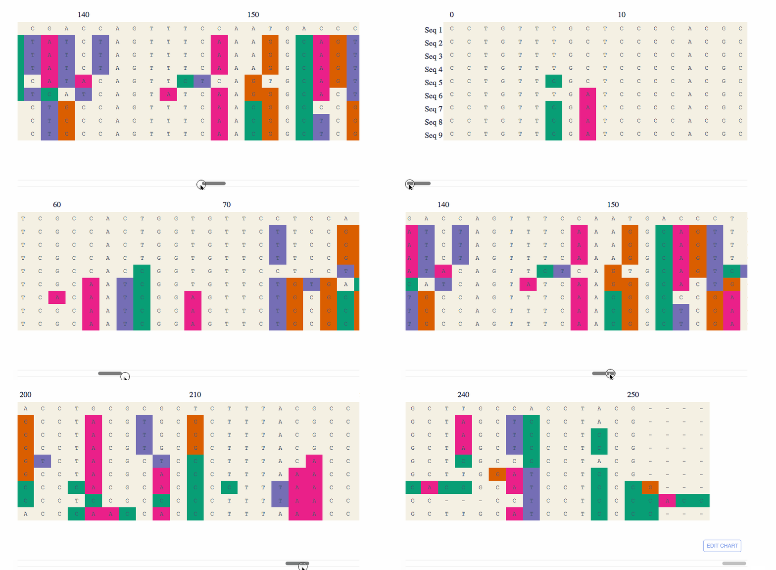
If you liked this post, you might like these 7 bioinformatics visualizations also made by Plotly users: