Plotly serves a large bioinformatics and biostats research community. These users leverage the uniquely interactive features of plotly charts for dendrograms, heatmaps, volcano plots, and other visualizations common in this field.
Here are 7 resources in Python and R created by plotly bioinformatics and biostats researchers.
1. Jupyter notebook: Visualizing bioinformatics data with plotly and python
2. Zoom & hover in volcano plots
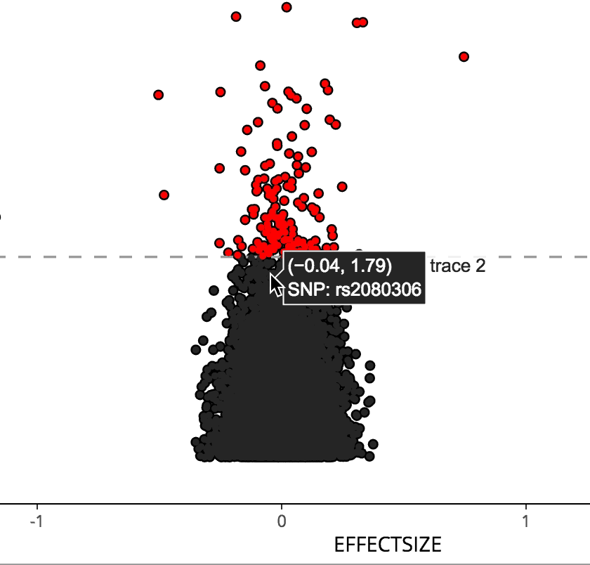
Sahir Bhatnagar has brought interactive volcano plots to R with the most recent CRAN release of his manhattanly package. Sahir was also a speaker at PLOTCON NYC!
3. interactive dendrograms in r & Python
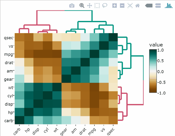
Tal Galili, the maintainer of the popular R Bloggers website, has published heatmaply on CRAN for easy creation of heatmap dendrograms in R.
In Python, Oxana Sachenkova added heatmap dendrograms to the Plotly Python library.
4. Toggle lines and distributions with the legend
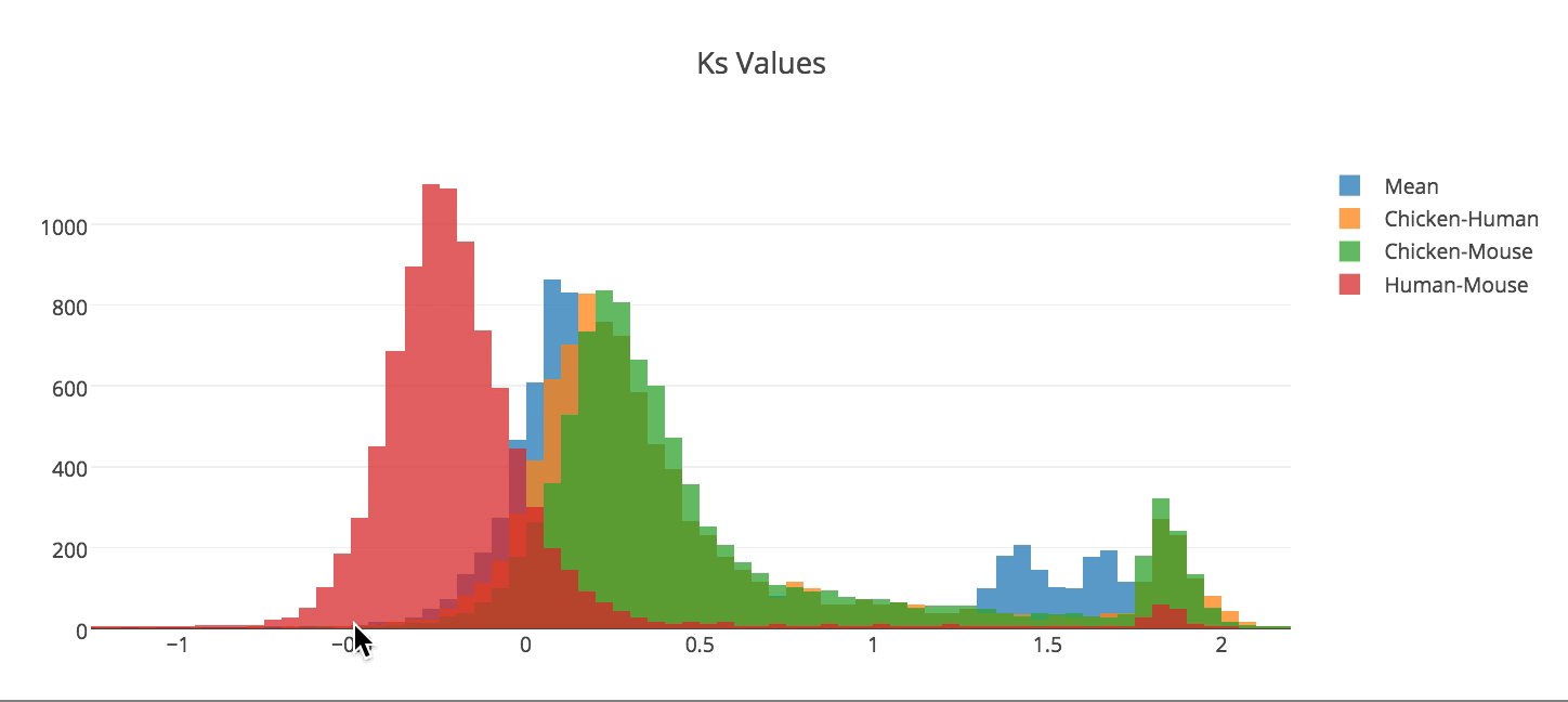
Asher Baltzell created these histograms of Ks values in Python. You can toggle lines, points, and distributions in plotly charts by clicking on them in the legend.
Asher has a fantastic and fun introduction to Plotly and Python presentation on his GitHub and was a speaker at PLOTCON NYC!
5. take it to the 3rd dimension
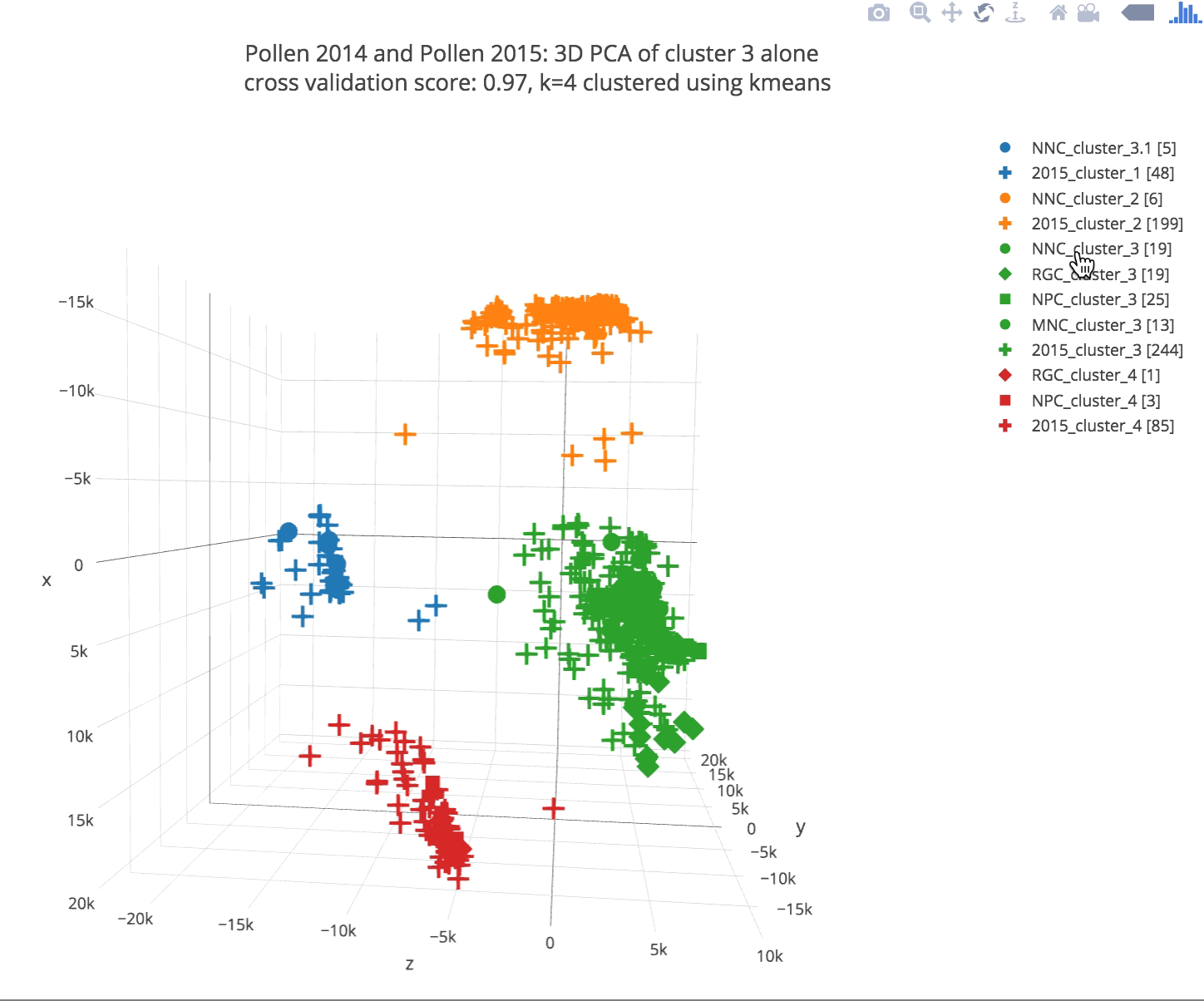
Plotly’s open-source 3d graphing library is a modern replacement for MATLAB, matplotlib (in Python), or RGL (in R). Plotly 3d graphs use WebGL, which makes them interactive, lightening fast, and embeddable in the web. This chart was made by bioinformatics start-up SMPL BIO. Plotly 3d charts were recently showcased in Nature for the 3Disease Browser project.
6. INTERACTIVE MANHATTAN PLOTS
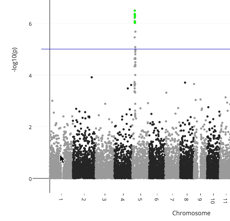
Manhattan plots are another staple of the bioinformatics world, but they weren’t easy to make interactive in R or Python before Plotly and Sahir’s Manhattanly R package. Manhattanly is available for R on CRAN.
7. GENE EXPRESSION HEATMAPS
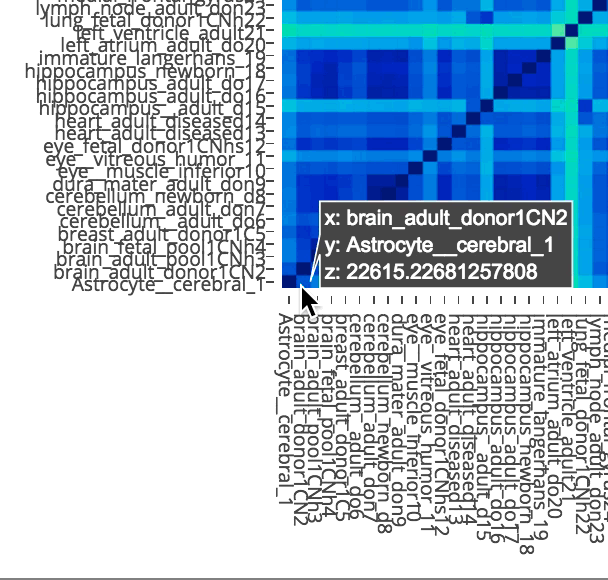
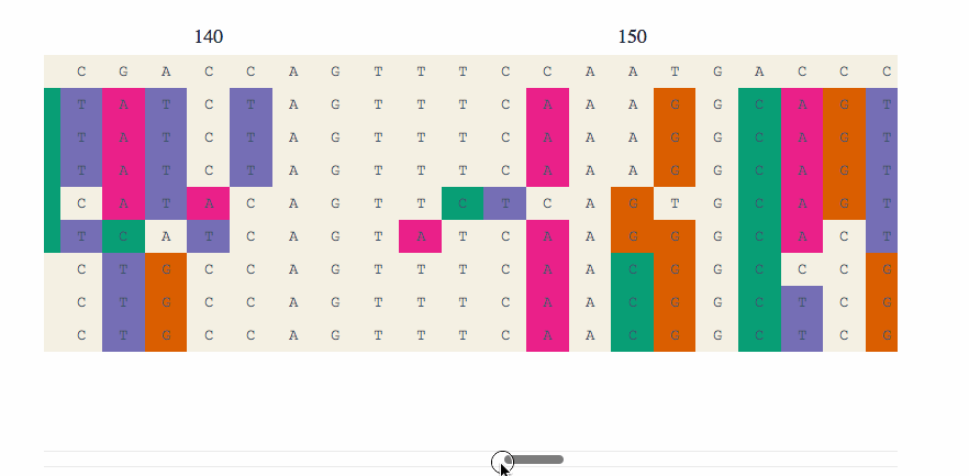
You can easily zoom into dense gene expression heatmaps in Plotly. This heatmap is from Oxana’s Jupyter notebook, Visualizing biological data: exploratory bioinformatics.
Plotly is built by computational scientists with degrees and research expertise from McGill, Harvard, Stanford, and other world-class institutions. Making no-compromise open-source software for scientific visualization is our full-time job and passion. Want to support our work? Consider purchasing a Pro plan. For less than half the cost of a Tableau license, you’ll get support from our engineering staff and time-saving ways to save and share your work with colleagues, advisors, or managers.
Pro Plans for University students and instructors ($59/year)