new webinar december 6: using plotly with excel
Tomorrow (Wednesday December 6), Plotly solutions engineer Branden Dunbar will give a free webinar on creating online reports and Tableau-style dashboards using Excel data.
Register and view past Webinars here: https://plot.ly/webinars/

MONTRÉAL WORKSHOP SERIES, FEBRUARY 2018
Plotly workshops are back in February at Plotly’s headquarters in Montréal. Take your data science skills to the next level with workshops for:
- Python / Dash
- R / Shiny
- SQL and Dashboards
Registration is open! https://plotcon.plot.ly/workshops
TABLEAU-STYLE CROSSFILTER DASHBOARDS
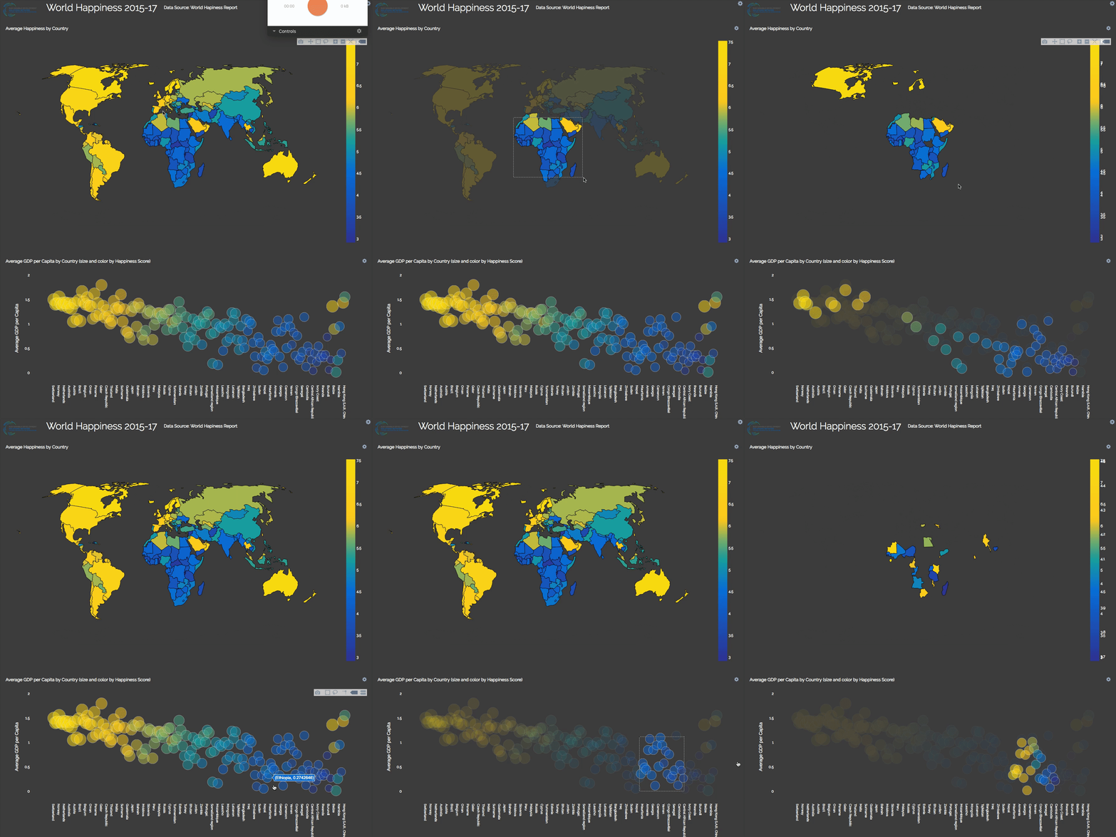
Similar to this popular Tableau feature, selecting data in Plotly dashboards can now filter all dashboard charts with the selected data.
To get you started, we’ve prepared 7 crossfilter tutorials with public health data on Plotly’s Github:
https://github.com/plotly/public-health/blob/master/README.md

code-free report authoring with d3 charts
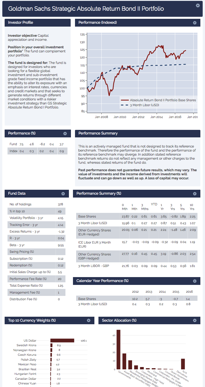
Plotly dashboards now have a “Report Mode” so that you can compose and share online reports with D3.js graphs, all without writing any code. Take a look at this remake of a Goldman Sachs financial report on Plotly:
https://plot.ly/dashboard/jackp:17887/present

new falcon release
Everybody’s been talking about Falcon, Plotly’s new open-source client for SQL. As an open-source project, Falcon is constantly improving and last week we pushed a version with:
- Mac and Windows GUI installer (no longer need 7zip)
- Reduced download size
- Tons of bug fixes and UI polishes
Get this latest release on Plotly’s GitHub:
https://github.com/plotly/falcon-sql-client/releases/tag/v2.3.3-beta1
If you missed it, you can also familiarize yourself with Falcon by watching our Falcon webinar from 2 weeks ago.