Andy Kriebel recently pointed out that Tableau dashboards let you export their underlying data. Using data frames in R or Python we can read data from Tableau. Then we can plot with Plotly’s Python and R APIs. The use case: collaborate and share data across languages and teams.
Let’s try it out. The R code for this post is in an R Notebook; the Python code is in this IPython Notebook.
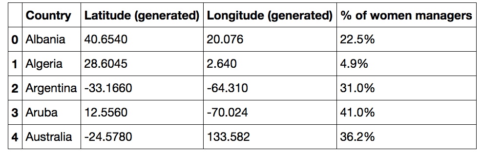
One of Andy’s Tableau visualizations shows the percentage of female managers by country. We add .csv to end of the Tableau URL and make a data frame that looks like this:
Using pandas in Python or ggplot2 in R, we can make an interactive Plotly graph. The histogram below shows how many countries have a given percentage of female managers. See the R Notebook or IPython Notebook for the code.
You and your team can go the other way too: make 2D, 3D, and live-streaming plots using the Plotly web app and APIs for R, Python, and MATLAB then embed into Tableau in an iframe.
Email feedback@plot.ly or tweet to @plotlygraphs with any questions or suggestions. Contact us if you’d like to start using Plotly Enterprise on-premise.